
David Herrle interviews Michael Walker, painter
David: Like most visual artists, you have a distinct repertoire of pet motifs: trees, sinister or dreamy silhouettes, black-and-white checkerboard patterns, ominous skies, floating orbs, telephone poles, devils, towering wendigo-like monsters and variations of the skeleton (the truly nude body). Are these deliberate choices, or are they embedded, so to speak, in your psyche or whatever the hell you call your subliminal self?
Michael: I try to use images or motifs that speak to our primal selves. Like the trees for instance. I’m not painting Bob Ross “happy little “trees here. Maybe it’s from living in a northern climate most of my life, but, I’ve always been captivated by the contrast of bare, skeletal branches against the blue of a winter sky.
The checkerboard pattern goes back to when I was just discovering my style, if you can call it that. It’s a simple way to create motion for the eye, and it probably goes back to my reading of Carroll’s Alice’s Adventures in Wonderland at an early age and tripping out on the illustrations. A lot of the motifs I choose, such as the telephone poles, are used as tools to create perspective in my landscapes and compositions. Simple tricks at my disposal. As for the skeleton, why that’s the most primal of images for our human psyche. It is our true face.
I don’t feel like anything is deliberate in what I create, honestly. These works come to me 100% complete in my mind. In a flash. They change a bit in the process of creation, however, the choice isn’t really a thought-out process. So, I guess they are brought up from somewhere deep in my subliminal self as you put it. [Image below: Welcome to Wonderland, Alice]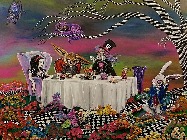
David: In Welcome to Wonderland, Alice you were audacious enough to paint your own version of John Tenniel’s illustration of the demented tea party in Carroll’s Alice’s Adventures in Wonderland. Your off-kilter style pervades, of course, and the scene’s surrealism has a paranoiac glaze, particularly in the eyes of the White Rabbit and the March Hare. Alice is a murderous harlequin/Goth chick, and the Mouse grips a Reaper’s sickle. Paintings – especially ones by Hopper – are fundamentally silent, but some of yours cackle, as this one does. You’ve reiterated/reinterpreted other iconic images, such as Storm Thorgerson’s cover image for Pink Floyd’s Animals, Bela Lugosi’s Dracula and Jim Morrison. How do you approach such projects?
Michael: Like the paintings of the original Icon I guess. Jesus was the Pop Star of the Middle Ages when it came to painters, sculptors and artists in general. Think of a photograph of the crucifixion. Could you imagine that? I’m sure that if the crucifixion of Christ were to happen today someone would livestream it on Facebook. We are so inundated with photographic images today, and there is such a wealth of photographic record of our idols and icons, that these images are embedded in our minds. I approach them with a sense of awe and love. To represent them through my artistic perspective but with all respect to the photographer, who is the true artist in this case, capturing those unique and sometimes candid moments of our modern icons, the celebrities and rock stars of our time. Our modern saviors from our mundane lives. The photographic catalog of images at an artist’s disposal today is both a blessing and a curse. It’s a blessing in the sense that there is so much to choose from for reference material and a curse in that you feel like it’s all been done and originality is dead.
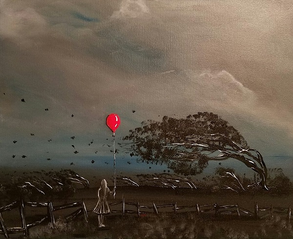
I was given books when I was young from my artistic mentor and teacher, my uncle Peter Dragovich. He provided me with the fuel for a lot of my art today. One book featured a cinematic history of the horror and sci-fi films from the beginning, to the time of publication, which I think would have been in the late 1970s. This book contained the most wonderful stills from the great monster flicks of the 1930s through the 1950s: Dracula, The Wolfman. The scenes were beautiful. The staging of the starlets and the stars in a soft, black-and-white glow. Those really inspired me in some of my earlier works in graphite and ink. A lot of what I do comes from my consumption of the entertainment industry and I just regurgitate it as my own art. [Image below: Steadfast]
David: Speaking of stylizing iconic and/or familiar images, some of your best work is from your Pittsburgh Traffic Purgatory Series, which features selected urban scenes that are familiar to natives and seasoned residents, as well as iconic far beyond our famous city: Mount Washington, the Fort Pitt Bridge, PPG Place, Sharpsburg, etc. Some folks may notice a deviation from more traditional framing of scenes, unlike Kubrickian squared-in symmetry. Are your perspectives purposely skewed? Are these pieces sketched on location or rendered from photos?
Michael: The whole concept of the Pittsburgh Traffic Purgatory series came to fruition through me being stuck in our unforgiving, soul-sucking Pittsburgh traffic. As I drove to work I would be stuck in traffic and try to not hate everyone in front of me. I would gaze off at the surrounding architecture and landscape and lose myself in artistic thought. I would see these angles formed by the power lines and jutting forms of the buildings cutting into the sky. That’s what captivated me. I was trying to convey the view from the point of the hapless soul stuck in a tin can on the way to hell (work). I would snap a photo of the scene with my phone and work from there. I never sketch on-scene, and I rarely sketch out any of my works prior to completing the finished piece. If you could see how rudimentary my sketches are you’d laugh. I’m definitely a studio artist. [Image below: Pittsburgh Traffic Purgatory Series: Mt. Washington and Fort Pitt Bridge]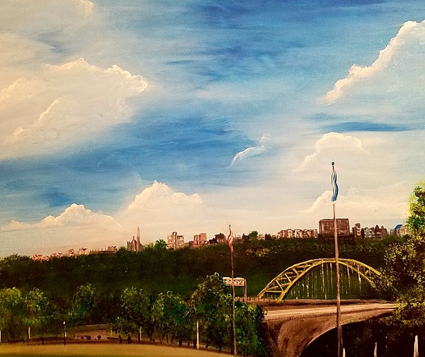
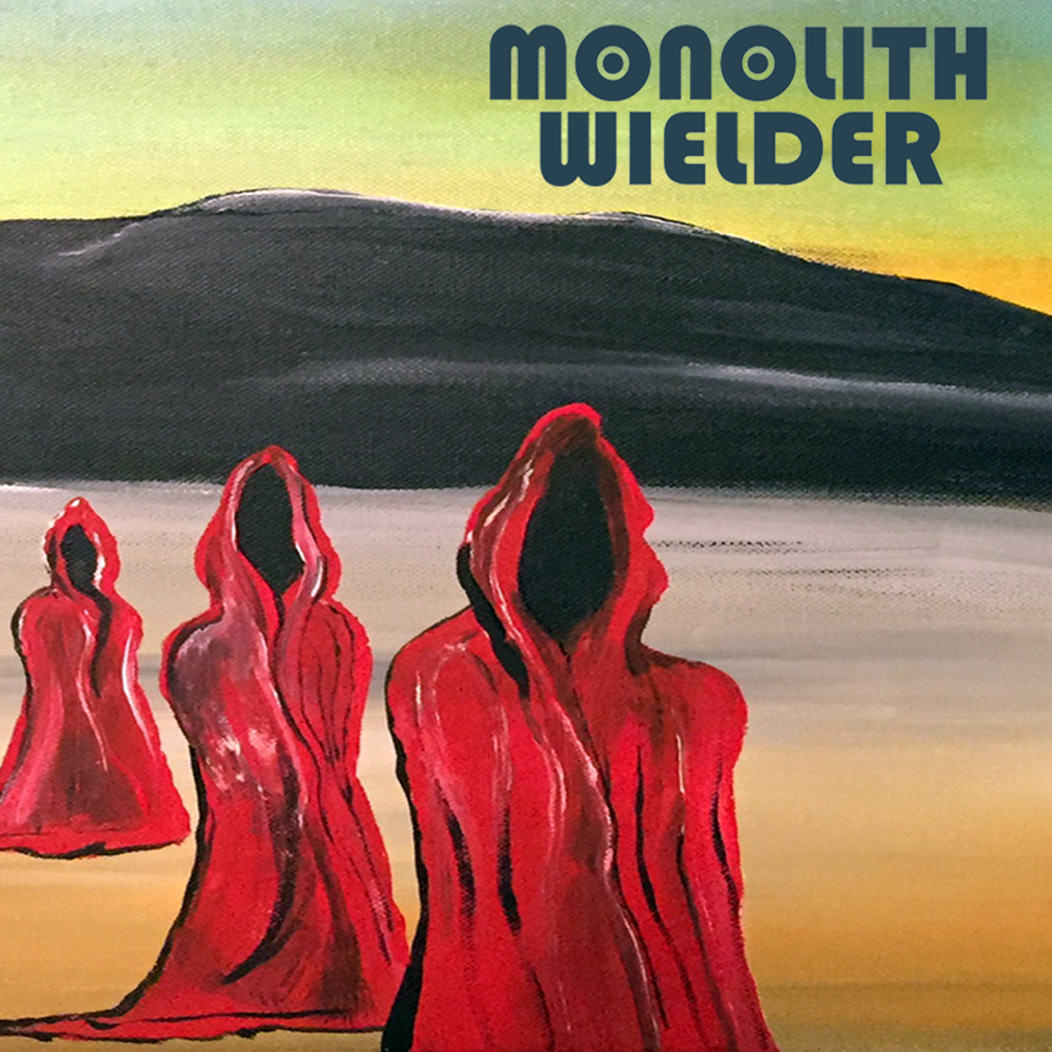
David: Often, creating art as a second job can feel isolative and discouraging, but you receive some very worthy recognition: gallery exhibitions (a semi-permanent one at the Carnegie Coffee Company), the mascot/logo on a food truck for The Coop Chicken and Waffles, special commissions and the cover art for a Monolith Wielder album (for which Walkerian eeriness seems to have been perfectly destined). Do you have a preference for either public exposure or patronized projects? How do you view and handle the financial facts of producing visual art?
Michael: “Walkerian eeriness.” I like that! I hope that sticks. I’m fortunate and cursed at the same time. I’ve always created art and always will, but I support that habit by working full-time in other fields, so the frustration of being an artist is always present in my mind. There’s never enough time to create, so I steal moments when I can.
I would prefer public exposure. I want to have people experience my art. The Monolith Wielder gig was awesome. They just contacted me via social media and were like: “Hey! We really dig this 13 Apostles piece and would love to use it for an album cover”. It was a perfect fit. When I was a kid my dad had an extensive vinyl collection with the coolest album covers. Black Sabbath, Steppenwolf, Savoy Brown. The cover art spoke to me, and I would gaze at them and sketch them. If something I painted could inspire another human to create on their own? That would be fulfillment as an artist. I’m here to wake people up.
I’ve also been fortunate enough to be relatively unfettered in the commissions I’ve received. My clients are looking for a style or edge for their projects that my work can achieve. The few projects I have “professionally” completed have been commissioned by people who want me to freely express my creativity, and I’m very grateful for that. I’m a starving artist, but I’m free. [Image below: 13 Apostles as album cover]
David: You strike me as an autodidact, one who’s particularly driven by a personal, peculiar style and pretty liberated from pedagogic pretense. Tell us about your informal and formal (if any) practice over the years.
Michael: You are correct in that assumption. I have had very little formal training in the arts. You probably have a better working knowledge of the techniques and styles I use than I do. I feel that if I spend my time worrying about the academic aspect of my work I’m not creating, I’m just studying.
From a very young age, as I mentioned before, I was mentored in the art of drawing by my uncle. He was probably the best artistic influence in my life. He was self-taught too. Most of what I’ve learned came from emulating his style and copying from books. I was one of three or four talented students in my high-school art classes who had free reign over what projects we worked on. It was a very liberal upbringing. When I left high school I attended the Art Institute of Pittsburgh for one semester. I remember my first figure-drawing class. The professor began talking about how she was going to teach us how to be artists. I raised my hand and said that that can’t be done, you either are or you aren’t an artist, all she could teach us were some techniques. Of course I was asked to stay after class to discuss my portfolio.
David: Are you less comfortable depicting human figures than you are of doing fantastic ones? Your rare humans have a slight sprinkle of Modigliani and Martina Shapiro. Tell us about human portraiture versus imaginary, mystical subjects.
Michael: The human form is one of the most beautiful and grotesque forms to render. Sometimes it can be a mystical subject. I wouldn’t say that I’m less comfortable rendering the human form versus the imaginary or mystical beasts that plague my work. I’m more attracted to the mystical creatures. They’re more fun to create and there isn’t much basis to their structure. If I elongate an arm or get something out of proportion, who’s to say it isn’t supposed to be that way? When I do render the human form in my work I tend to focus on one section of the body. Set it off and crop it or frame it askew. Create a juxtaposition that isn’t quite right. Such as the piece “What Have We Done To Our Fair Sister?” The female form makes up the landscape. It’s not that I am uncomfortable with portraiture, it’s just that, to me, photography rendered realism in painting obsolete. [Image below: What Have We Done to Our Fair Sister?]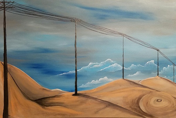
David: In the preface of The Denial of Death, Ernest Becker sums up the primacy of our underlying dread of mortality:
[T]he idea of death, the fear of it, haunts the human animal like nothing else; it is a mainspring of human activity – activity designed largely to avoid the fatality of death, to overcome it by denying in some way that it is the final destiny for man.
One can’t deny your non-denial of death, nor can anyone accuse your art as a death-denying activity. On the contrary, death is dominant in much of your work. Please share your thoughts on our grisly common destination. Is it grisly? Do you feel a dread of death?
Michael: Death is a specter that has clung to me since the time I became conscious of being alive, and I keep it in the forefront of my mind. I think that all the money that is spent in creating instruments of destruction and death ought to be reallocated into serious research into what death is and how it can be stopped. Yes, it is the end of the physical self and this organic matter is what produces the consciousness that allows us to realize that we are one day going to die. But, what happens after and where the hell was my consciousness before it got brought into this mess? It is an abyss of thought that I have fallen into many a night. Usually it is right before I fall asleep, in the dark confines of my room so like the grave that the fear of the unknown creeps in and it’s like a complete panic attack for a split-second. Yeah, I feel a dread of death. Perhaps that’s why I keep it in my thoughts. In my work. It makes all our everyday problems seem like total bullshit, which they are. Nothing quite compares to it. I feature the images of the skull and the skeleton in my work as a reminder to myself and the viewers of the pieces that one day all they are will cease to be. It’s my therapy. As Dickens said, “we are all fellow travelers to the grave.”
David: One of my life’s crusades is repudiation of anti-beauty bigotry, which has been entrenched and wrongfully legitimized by forces such as the Avant-Garde movement, Nurse Ratched gender-feminism (not to be mistaken for creative equity-feminism), naturalism (Flaubert’s “the time for Beauty is over”), photojournalism and hysteria over so-called “body image.” I think much hope lies in the continued power of fashion photography and – dare I say – pornography, thankfully. Do you notice a demonization of beauty in art? If so, what are your thoughts on it?
Michael: I think beauty comes in several forms. The female form in its classic “hot” schoolboy-adolescent wet dream-/pin-up girl/angel/centerfold style is dead, in the sense that we realize that this has been spoon-fed to us for so long, to sell us shit we don’t need, and people are smarter than that now and are starting to rebel against it. But there is no denying that beauty is being scorned now by self-esteem police. Some people are just more attractive than others. That doesn’t mean we shouldn’t acknowledge beauty when we see it and celebrate it.
I paint angels and demons. Both are beautiful to me, but I’d rather fuck an angel. [Image below: Mr. Mojo Risin’ is Nevermore]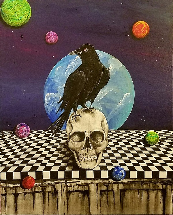
David: Your hashtags make it quite clear that music is a fundamental inspiration for you in the studio. Muster an ideal painting playlist for us.
Michael: My playlists change for the piece I’m doing or a particular portion of a work. For instance, I played Jefferson Airplane’s “White Rabbit” on repeat until that image was complete in the Welcome to Wonderland Alice… piece. I guess I would have Portugal.The Man, Built to Spill, Savoy Brown, The Doors, The Beastie Boys, Modest Mouse, Jack White (in any of his many side projects or solo), Pink Floyd, Syd Barret, The Beatles and some Gorillaz.
Any musician or band that has heady, dark lyrics with a hypnotic beat is in my playlist. I’m happy to say that my sixteen-year-old son digs my musical choices, and I have been turned on to some great music by him. Music is a constant in my creative process and my life. I once heard someone say that music is the highest form of art and I strive to infuse its power in my works.
Visit Michael’s Mind Slop Art site.
See more selected art here.